And have been for six months. This chart may seem unbelievable or impossible, but it's correct, based on weekly data from the British government.
The brown line represents weekly deaths from all causes of vaccinated people aged 10-59, per 100,000 people.
The blue line represents weekly deaths from all causes of unvaccinated people per 100,000 in the same age range.
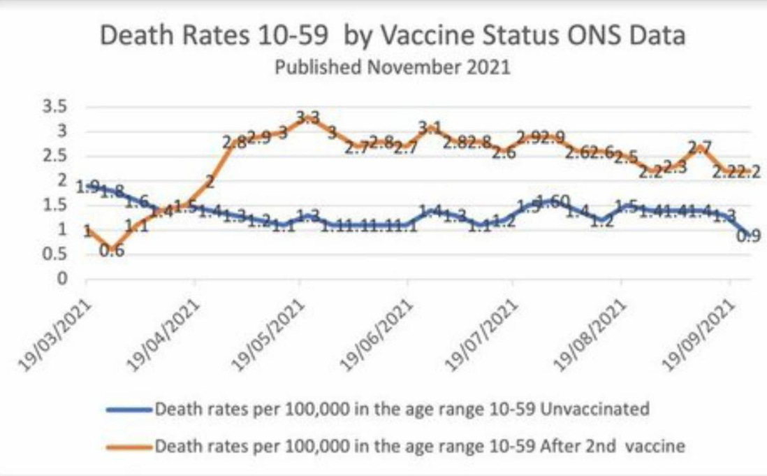
I have checked the underlying dataset myself and this graph is correct. Vaccinated people under 60 are twice as likely to die as unvaccinated people. And overall deaths in Britain are running well above normal.
I don’t know how to explain this other than vaccine-caused mortality.
The basic data is available here, download the Excel file and see table 4:
https://www.ons.gov.uk/peoplepopulationandcommunity/birthsdeathsandmarriages/deaths/datasets/deathsbyvaccinationstatusengland
#1: Esso To: Horse, 4um (#0)
It's obvious that the unvaxxed are causing the vaxxed to die. Easy-peasy.
Esso posted on 2021-11-22 03:22:47 Reply Private Reply
#2: StraitGate To: Horse (#0)
But if these numbers are correct, one explanation could be that healthier people are less likely to get the injections. And the death rate for healthy people is naturally lower than that of the unhealthy.
StraitGate posted on 2021-11-22 08:02:46 Reply Private Reply
#3: BTP Holdings To: StraitGate (#2)
I refuse to allow the clot shot to be administered to me.
I have other health problems also the doctors are doing their absolute best to screw up beyond belief. :-/
BTP Holdings posted on 2021-11-22 08:11:58 Reply Private Reply
#4: Horse To: StraitGate (#2)
Horse posted on 2021-11-22 08:48:03 Reply Private Reply